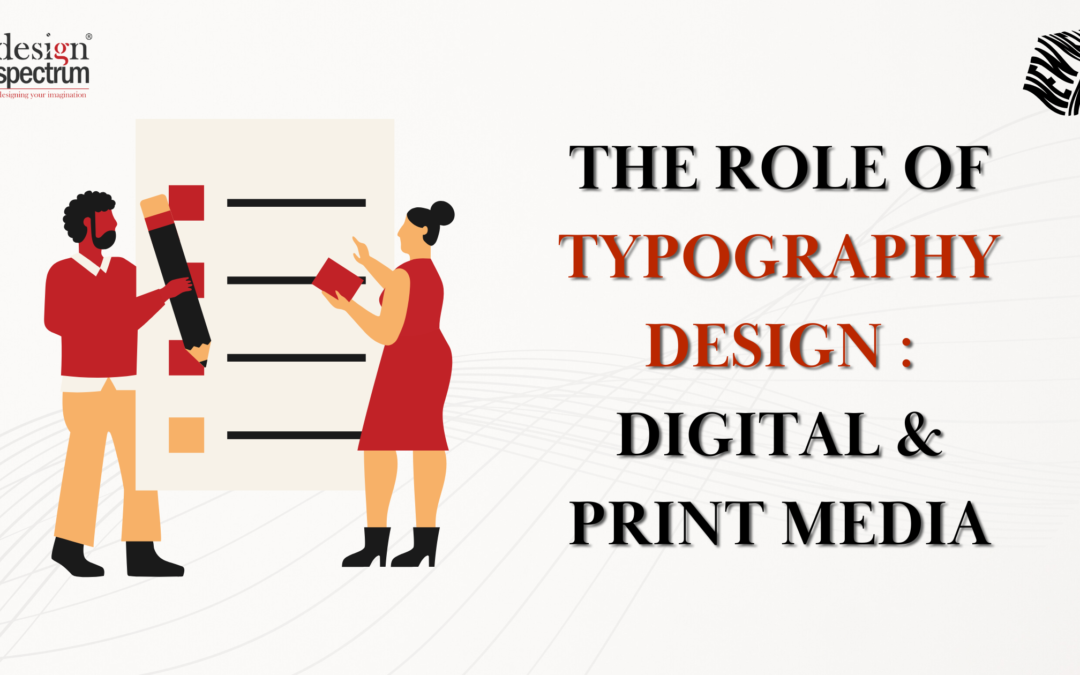
Introduction
Have you ever heard that typography design can increase understanding by up to 20% and within seconds can establish a brand perception? It is however, important to bear in mind that typography design is not just a font you select, rather it is an integral part of a design that influences the way a text is understood, the character of a certain brand, and the interaction with the target audience.
In both of the cases whether it is printed material or electronic media typography design works strategically to convey the message and provide brand identity, building a cohesive brand personality. The focus of this blog is how typography can combine beauty and pragmatic purpose within different media and therefore is of utmost importance to contemporary design and modern typography trends.
Table of Contents
What is Typography?
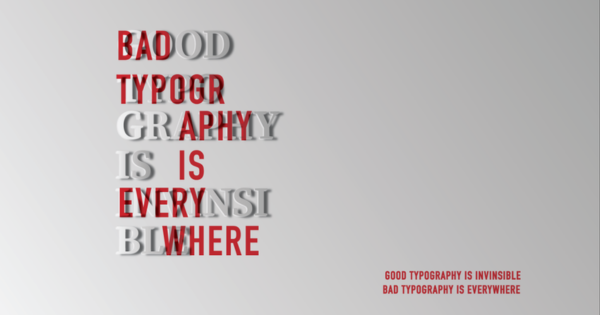
Typography is the skill and art of arranging texts in a way that makes the language legible and pleasing to the eye. It involves selecting fonts, marrying spaces, and developing layouts to evoke a certain feeling or brand. Similarly, in both printed and virtual design, typography performs an important function of establishing hierarchy, directing focus to certain parts, and improving interactions.
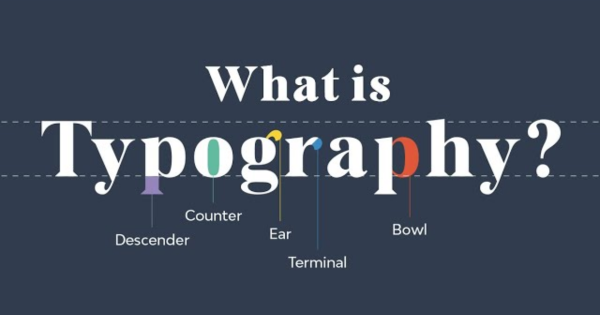
Properly done, typography combines art and purpose so that a text is not only beautiful but also functional and suitable for distribution across various media and devices.
Understanding Typography Design in Modern Media
Typography design is the practice that exists in carving text into form in a way that is appealing to the eye. In step with the advances of digital media and printed materials, typography design has expanded to new formats without losing the essence of the brand. The need for effective typography design has become instrumental for brands since audiences demand unyielding typography across different platforms including websites, social networks, as well as printed material.
In today’s world, brands prefer to have their typography optimized for print as well as for devices with high pixel density. This type of cross-platform pliability is therefore beneficial for brands as it ensures that a coherent and professional appearance is espoused, which is important in brand recall as well as customer retention.
The Importance of Font Selection
Typography is a crucial aspect of the designing process and therefore, it is important to choose the right font. The choice of font is not only of visual importance – it has effects on the mood, the legibility, and the professionalism of a design. If a specific typeface is used, people and the target audience know what to expect.
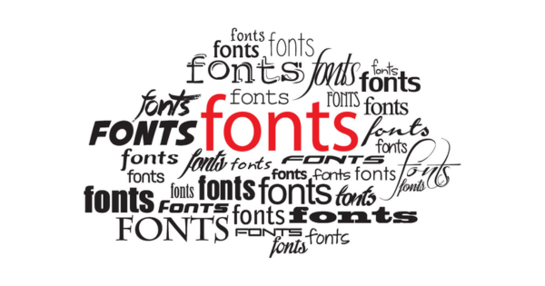
In particular, Sans Serif typeface trademarks are modern and simple which is why they are a perfect fit for numerous tech or minimalist applications. On the other hand, brands that aim at tradition and authority may find the use of Serif typefaces appropriate as they provide a classic and elegant touch. Tools like Google Fonts and FontPair can help designers explore and select the perfect fonts, offering a wide range of choices and pairing suggestions for both digital and print design. Here are some key benefits of choosing the right font:
• Improves Readability
To take full advantage of readable fonts, the users don’t have to put too much effort into engaging with the content, be it in paper or online mediums. With regard to digital typography, readability is essential even at smaller scales hence the typeface chosen should be simple yet appealing. There is a constant debate over the serif font which in most cases, is believed to be the best choice for printed material due to its ability to enhance the reading experience.
• Enhances Brand Recognition
Repeated and consistent use of particular fonts on various channels improves the chances of consumers recognizing the brand as they learn to connect the design with the name. In addition to accentuating a brand image, font types can also be utilized in different logos making the brand more distinctive.
• Professionalism and Tone
Using the designated font in a template design is crucial when it comes to presenting the brand as it looks professional. Sometimes, not even the message intended can be delivered if the required font cannot be positioned in an appropriate way. Fonts have the ability to mirror the voice of a brand and this enables brands to communicate more effectively.
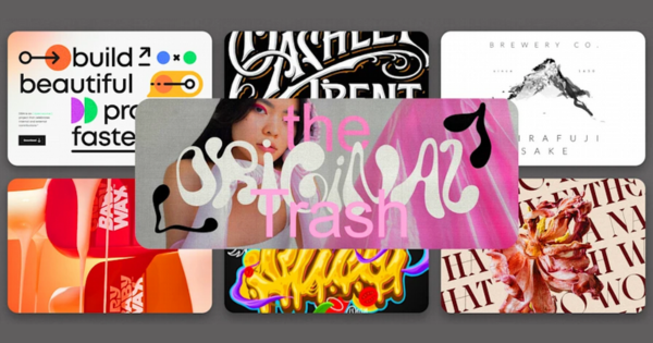
Typography Trends Shaping Digital and Print Designs
In any design, typography works in a manner that compliments the general strategy of brands’ designs, enabling them to emerge as aesthetically competent. Below are typography trends in 2024 that are isolated within digital and print.
- Variable Fonts: It offers a range of types with different weights and widths but is contained in one typeface. This can be good for digital usage and offsets.
- Animated Typography: Text that has motion effects is mainly used on websites, this makes websites and social media more fun and mobile.
- Bold Typefaces for Print: With graphics widely placed over billboards, magazines, and posters, bold and expressive typography sells them at its best.
Readability and Accessibility: The Pillars of Typography
Readability refers to one that ensures the intended message is comprehensible and that users can interact with the content which improves their experience and attracts a wider audience.
- Readability in the Digital Environment
Screen sizes and resolutions are significant factors when it comes to digital readability. Designers usually select larger fonts coupled with high-contrast colors to enhance legibility when translating materials to mobile viewing format.
- Readability of Text: The Print Media
Readability in printed materials is influenced by paper characteristics and the quality of the ink used, as text is instead viewed on a sheet of paper.
- Accessibility : Everyone’s Audience Size
An essential feature of the typography is the availability of large readable fonts and high contrast to the background. Creating styles that are easy to use in typography embraces diversity by helping to ensure that all target consumers can access the content.
Graphic Design Principles and Typography
The role of typography does not end in font selection. Typography involves the infusion of some elements of design such as balance, contrast, and alignment.
- Balance: Use images, typography, and whitespace in volumes that will achieve balance and control how the viewer focuses.
- Contrast: Always use contrast typography (a larger picture or bold heading letter against lighter body text) to emphasize key information.
- Alignment: Proper alignment is very important to improve structure and assist while reading whether in a magazine or on the site.
- Whitespace (Negative Space): By adding margins in typography, we give breathing space to the design. It is desirable to make typography more legible and aesthetic. Such usage of negative space will reduce mess on pages thus improving reading and aesthetics.
With these principles, the type assists in breaking up the text, reads the content better, and makes the overall look more professional and clean.
The Role of Text Hierarchy in Typography Design
The hierarchy of text in typography design is of paramount importance, as it helps the readers to navigate through the content efficiently. Creating an efficient hierarchy involves the appropriate use of font size, weight, and style for headings, subheadings, and body text with the aim of enhancing the ease of navigation to the content.
- Enhancing User Experience with Digital Media
When it comes to digital media elements, there is a hierarchy of text that guides people across websites or app interfaces to improve the experience.
- Increasing Readability in Printed Materials
When it comes to print, there is a hierarchy of the text which helps in emphasizing the key pieces of information, hence simplifying the reading of such materials as magazines and brochures.
Such a hierarchy strengthens the brand and improves the user’s experience, reflecting a consistent brand personality and adhering to typography trends, making typography an essential element of any design.
Conclusion
The design is an integrative part of digital and printed material, affecting the readability of a message, the personality of the brand, the order of things within frames, etc. Starting from choosing the correct type of font up to knowing the contemporary style, and even possessing fundamentals of graphic design, typography determines how the target audience interacts with the content. Proper and effective typographical designs improve visual appeal and reinforce the corporate identity while providing a unified experience on multiple touchpoints.
Considering all the above, in a modern environment where brands try to merge digital and print mediums, typography is still vital to the success of visual communication.