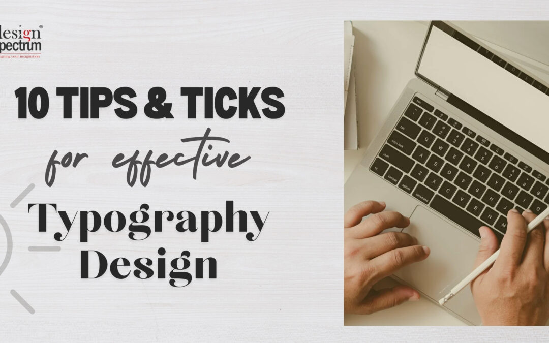
Typography design, often referred as just typography, plays a crucial role in any design that is created for print or digital purposes. A well-designed typography, can redefine the entire design, just as it is said, ‘Make it simple but significant’. The art and technique of arranging type to make written language legible, readable, and visually appealing. It involves the careful selection and arrangement of typefaces, point sizes, line lengths, line-spacing (leading), letter-spacing (tracking), and adjusting the space between pairs of letters (kerning). Typography is a fundamental element in both print and digital design and plays a crucial role in how content is perceived and understood by the audience.
Good typography sets the tone of the product, by establishing a strong visual hierarchy and providing a graphic balance in the entire design, be it for digital or print.
Table of Contents
Creating effective typography designs involves a blend of creativity, technical skills, and a good understanding of design principles. And most importantly a good knowledge of typefaces and fonts.
Here are some tips and tricks to help you create compelling typography designs:
1.Understand the basics of typography design

- Typeface vs. Font: A typeface is a font family, like for example Arial Font and all the font styles coming under Arial, while a font is a particular font style like Arial Bold.
- Visual Hierarchy: Use of different font size and weight to draw attention to text establishing hierarchy and guiding reader’s eye through the content.
- Alignment: Alignment is a very simple element but plays a very pivot role in any design, as it ensures readability of the text.
2. Choose the right Fonts

- Any designer should have the basic knowledge of fonts, and should know the basic difference of Serif & Sans Serif fonts
- Serif Font: Serif fonts have small decorative flicks at the ends of each stroke, mimicking a quill or pen
- Sans-Serif Font: In typography and lettering, a sans-serif or simply sans letterform is one that does not have extending features called “serifs” at the end of strokes.
- Pair complementary fonts, ensure legibility across devices and create brand consistency or identity.
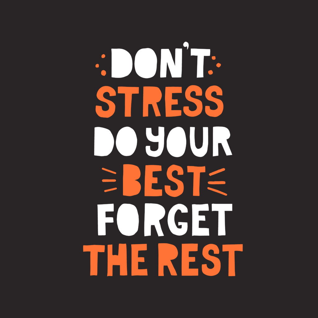
3. Use Contrast

- Size: You can create contrast by combining different fonts that blend in well and different point size keeping in mind the weightage that must be given to the text.
- Weight Contrast: Use different weight of fonts from the same typeface or the font families you have used in the design. Mix light, regular & bold weights to differentiate elements.
- Colour: Colour plays a vital role in any design; you can make your typography very attractive by choosing colours that standout. Ensure there is enough contrast between the text colour and background colour, for readability.
4. Mind the Spacing

- Kerning: Adjust the space between individual characters for a balanced and readable look.
- Leading: Control the space between lines of text to enhance readability.
- Tracking: Modify the overall spacing between characters in a block of text to affect density.
5. Experiment with Layout and Composition

- Grids: Use grids to structure your layout and maintain alignment and consistency.
- Whitespace: Utilize whitespace effectively to prevent a cluttered design and enhance readability.
- Asymmetry: Experiment with asymmetrical layouts to create dynamic and interesting designs.
6. Incorporate Visual Hierarchy
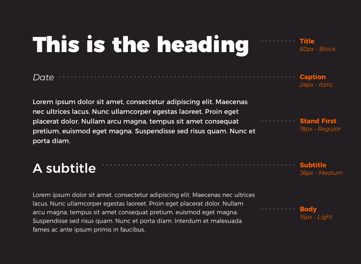
- Headings and Subheadings: Incorporate visual hierarchy by using headings, subheadings, and body text sizes and styles to guide the reader.
- Color and Style: Use different colors, styles, and weights to create a visual hierarchy and emphasize important elements.
7. Play with Typography Effects

- Shadows and Outlines: Play with text effects, add depth and dimension with shadows and outlines, but use them sparingly.
- Textures and Patterns: Incorporate textures and patterns within your text for a unique look.
- Distortion and Warping: Use distortion and warping effects for creative and eye-catching designs.
8. Consider the Overall Design Context
- Backgrounds: Ensure the typography complements the background and overall design.
- Imagery: Integrate text with images and illustrations thoughtfully, ensuring they work together harmoniously.
- Consistency: Maintain consistency in typography styles throughout your design to create a cohesive look.
9. Stay Updated with Trends

- Typography Trends: Keep an eye on current typography trends to keep your designs fresh and modern.
- Inspiration: Look for inspiration from other designers, typography websites, and design communities.
10. Test and Iterate
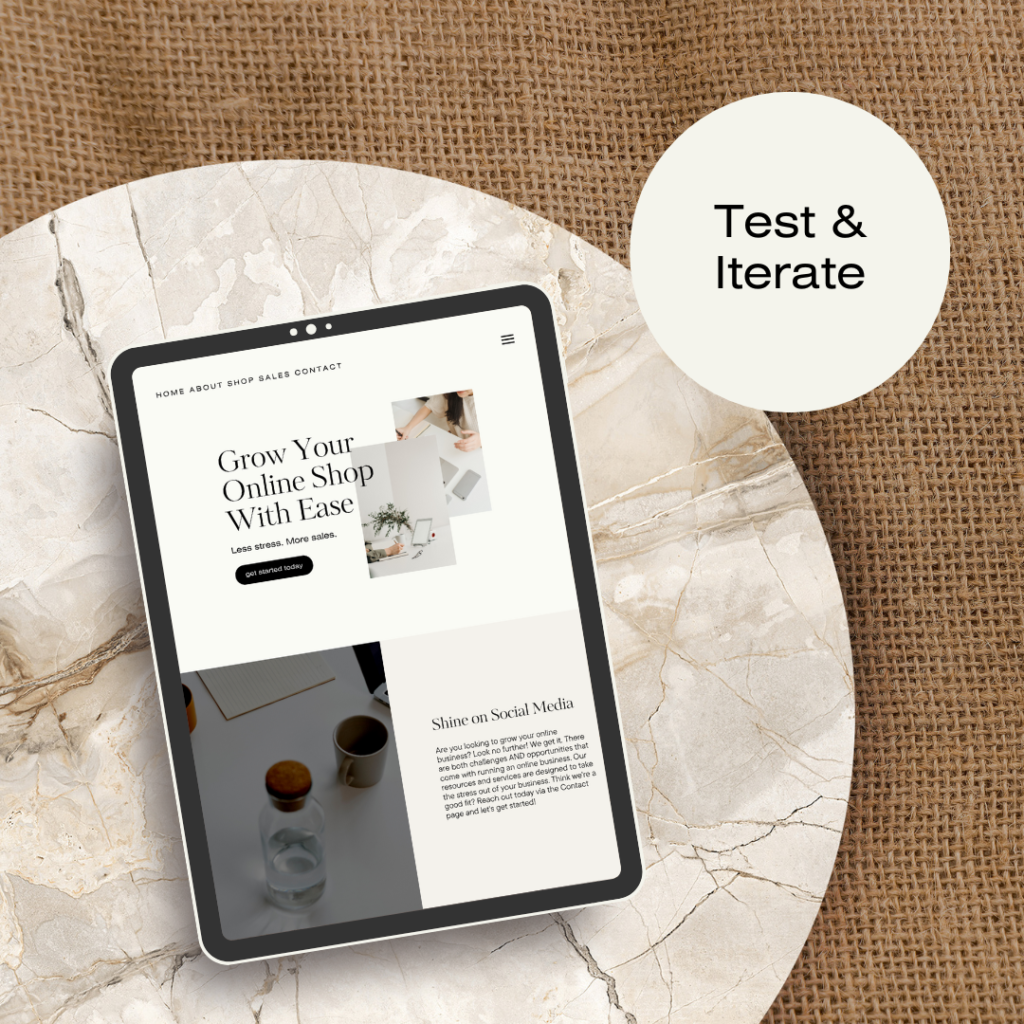
- Readability: Ensure that the typeface and font styles you have used are legible across devices and is visually appealing for the readers, test your designs for readability across different devices and screen sizes.
- Feedback: Seek feedback from peers or clients to improve your designs.
- Iterate: Be willing to make changes and iterate on your designs for the best outcome.
By mastering these principles and experimenting with different styles and techniques, you can create impactful and visually appealing typography designs, that effectively communicate your message and enhance the overall aesthetic of your work.
Here is sharing with you one of the best blog’s that gives deep insights on typography design books, to help improve your knowledge and develop a love for typography – https://www.typewolf.com/typography-books
In summary, typography design is a critical aspect of graphic design and communication, influencing the readability, functionality, and overall aesthetic of any text-based content.
Trackbacks/Pingbacks